But if I could hand this
 to a technician and say, "Reproduce this in glass, taking out those messy, superfluous curlicues, streamlining the lines a little bit, and rendering it in deep blues and purples,
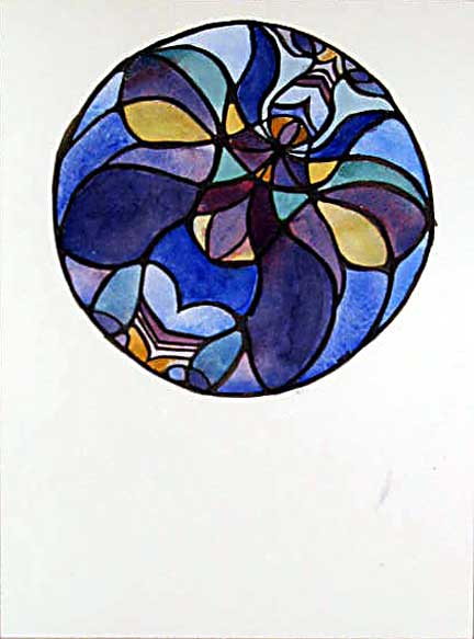
I would. The design isn't nearly as much fun to draw the second time around, much less building it in lead and glass.
 Also, color is hard when you can't put down six layers of oil and wax medium with a palette knife, scrubbing and carving back into it until you get the hue and texture and luminosity exactly right. I understand, now, why stained glass windows are so primary and diffuse in their color designs; you have to do it that way to generate contrast, when you only have about six shades to work with.
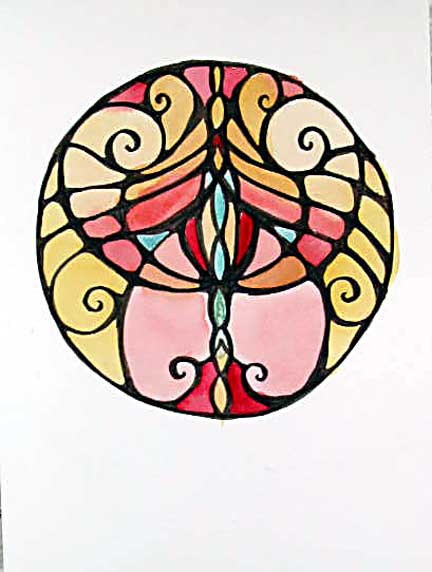
 But I don't want to do it that way. I want to have, say, some that are almost all blue, and some which are salmon pink with a few green details, and some that are gold and ochre, and some which are almost all white and beige.
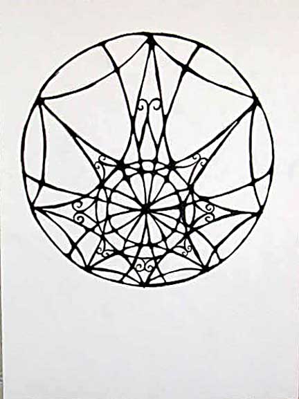
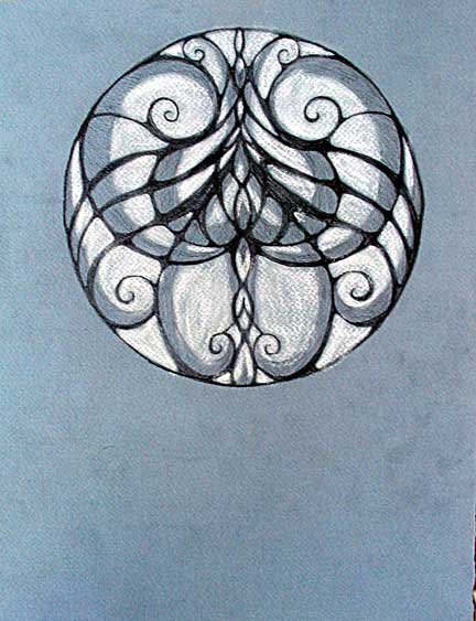
Invention fails me on this one. Tune in tomorrow when I've slept on it.


2 comments:
Boy, as soon as I saw the last black and white mandala, all I could think of was wrought iron fence design. Gorgeous...not everything needs color.
I'm so used to using watercolor and gouache I don't think in terms of layers the way you do. In fact I approach oils similarly, and the only real concession I make to their being oils and not watercolors is I'll layer for transparency and translucence.
So I've never thought that color is that hard. Except yellow. Yellow is really, really hard to work with, for me, anyway. Maybe if I'd gone to art school they'd have taught me how to work with yellow better.
I particularly like the color version of the second mandala. It's very pretty. Extra sexy.
Post a Comment