 The problem is that I got too carried away with fun, funky, fiddly curves before laying down the basic overall structure, then tried to fill in the structure around the fiddly stuff. Which means it just looks random and non-cohesive. My underlying inspiration was spiky, thistle-like shapes, but I whacked into it without enough of a plan.
 However, bearing this in mind, the next attempt was much more successful.

Thistles! Or maybe artichokes. Certainly something to explore further.
The next failed piece was conceived as a simple interference pattern, between two center points.
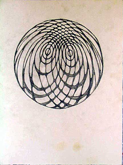
The problem with this one was that when I tried to do a more complex pattern, it became completely chaotic and unmanageable, but this is TOO simple. It could have been generated by a computer with more exactitude, but it would still be boring as batshit. It's no longer reading as a 'mandala', to my mind; it looks like a smear on the wall.
However, the one useful thing I learned while drawing it is that if you subtly emphasize the intersection points by accenting and smoothing the corners, it makes the whole image much more cohesive and dynamic, as though it were made of waves on water, or stained glass. I used this effect in the next two pieces:
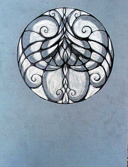 (And you thought the orchid was sexy...)
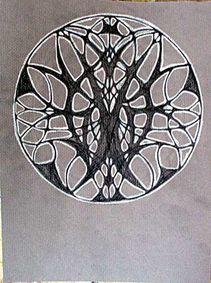
You may not even be able to see it in the digital image, but it is shocking how such a subtle adjustment causes the whole image to pull together and almost glow. What it seems to mean at this juncture is that I can start working with more-radical assymetries without losing grasp of the form as a whole. It also starts to make them feel slightly three-dimensional.


8 comments:
Serena,
Have you attempted to get stained glass commissions? These are wonderful designs. Multipied they would form a facinating Pattern and Design type background for a larger work. The only thing I can say is don't compartmentalize your work (that is, don't segregate one body of work from another. That leads to neurosis).
Also, don't spend too much time at paintersnyc. The snarkyness is not helpful.
Good Luck.
Bsch--agreed on all counts, on the compartmentalization and on paintersnyc. I'm only checking in about once a week, now. Painting and JPEGs are not good friends.
I am not sure how one would attempt to 'get stained glass commissions,' particularly as I have only started doing these pieces. If you have any contacts, please direct them to this blog and I am happy to open a dialog.
I have already started thinking about a project that would use these designs as a basis for a larger piece, perhaps structured as a large, fabricated collage. And of course my next paintings will be largely based on them, or at least strongly influenced by them. It's a process that is evolving as it goes.
I don't think any of these are failures. I like the first mandala a lot, particularly the little shrimp-like bits facing each other down near the bottom. I actually like the first one more than the second one.
Even the interference pattern is kind of neat, although, yes, it's not as good as the others you've been putting up.
The sexy one is indeed sexy.
I like how many of these you're doing. It reminds me of my crazed drawing phase a few years back (most of what's on my site are the result of that). These days things don't come as quickly; it's just one of those phases, I guess.
I agree with Chris. The pieces you described as failures simply seemed to reflect a concave perspective, and the ones you said were successes seemed to present a convex surface. Of course, the failures were failures in your eyes as you were "seeking" something else. But then they go into the world and create new roads of vision.
It's nice that you guys don't see the 'failure' that I do. Possibly the issue is that I AM specifically going for a kind of cohesive tension that becomes radiant--'convex' in Dano's terminology. The ones I don't like appear to me to suck energy from the environment instead of putting it out--'concave,' as you see it.
Thanks, all--your comments really help me clarify my perspective, both to myself and to others.
And Chris, the little 'shrimplike bits' down near the bottom were my whole reason for doing the piece, so thanks for noticing. I'll do another one that emphasizes them more.
Serena sez:
And Chris, the little 'shrimplike bits' down near the bottom were my whole reason for doing the piece, so thanks for noticing.
I'm observant like that.
I think the differences I see can be summed up thusly: The ones I like are vulvar, the ones you prefer look cruciform. Let me explain using more words: I see vulvas in your curlicues, but Christ on the cross in the others. And we all know what the cross represents, right?
I mean, look at that first mandala, the one which you call a failure. It's concentric combinations of vulvas and labia. It's like some mystical vision of an acid-trip yoni. Maybe that's why you feel it's absorbing energy.
Then that second mandala, it's a crown of thorns, repeated, with a cross and Sacred Hearts. It's fairly tumescent, bristling, penetrative.
And then the next two, you could call them Female and Male.
I happen to be a fan of vulvas. In case that isn't obvious. Penises not so much.
Good heavens. Just when I think the work I'm doing is so retro and inoffensive as to be laughed (or ignored) out of the NYC art scene, someone comes out with penises, vulvas, and Christ imagery. Will you be my marketing agent, Chris?
I've been told I have something of a one track mind. My sister, for reasons unfathomable to me, ended up going through my online gallery while I was on the phone with her last night. "More naked women. You used to do other stuff, you know. Now it's just naked women."
Post a Comment