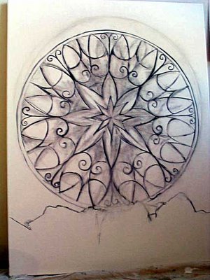
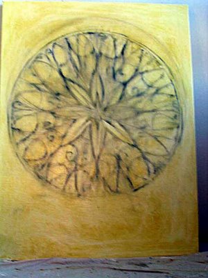
Continuing phases of the giant mandala piece:
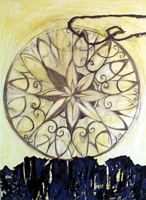
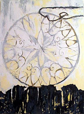
This one will be all about subtlety of form and color. It's surprisingly hard to do a nearly monochromatic piece and make it interesting; you DO NOT just slap on a single color, diluted with varying amounts of white. That is a mistake that has been made by countless amateurs since the dawn of time. Also, never build your brushstrokes in the same direction as the form. Why be redundant?
Another trade secret--plain white does not look bright white at all, it looks grayish and blah. Tinting the white makes it look whiter; tinting it with cerulean blue makes it stark, tinting it with yellow ochre makes it warm.
On a conceptual level--this was another one of those cryptic images that just announced itself in my brain. When I analyze it, I think it is about the way Platonic unity underlies the everyday, three-dimensional, linear-time world of our perceptions. The twisted, floating form up top is crucial; I think of it as the edges of the circle, yanked away and flung like a lasso.
This afternoon will be all about the rendering of detail. Life is sweet.
As a complete non-sequitur--am I the only person in the world, aside from my own wonderful sister, who finds the Fixx album "Reach the Beach" to be one of the underrated musical masterworks of the twentieth century? I was playing it the other day, and thinking that I would still like to choreograph an avant-garde dance to the song "Opinions." So many ideas, so few lifetimes.
Tuesday, February 28, 2006
Thursday, February 23, 2006
This guy is not oppressing me
It's been an uber-exhausting week. After comparing notes with a regular client, I discover that the vague fever, exhaustion, scratchy throat and congestion I've been carting around for a week and a half is, indeed, a low-grade version of the flu. Fortunately I did not get hospitalized with pneumonia and a 104 degree fever like he did. I've just been living on chicken soup and orange juice.
But of course I had to work anyway, as we self-employed people do. I did not start the marathon until after the contagious point had passed, and I'm always very careful to scrub up and not to breathe on people. What made it even more difficult was that half of this weeks' clients were prepaid or barter, and most of the rest were taking advantage of my $40 promotional special, so after twelve sessions I was able to deposit only a measly $325 toward defraying the now-seriously-overdue bills.
This is not a complaint, merely a statement of fact. I'm thrilled that my promotion is working, and that I've got the muscle mass and the stamina to handle it. Someday soon, I will be the most popular bodyworker in Brooklyn, and I will be proud.
Anyway, to amuse myself, I have been lurking on the massively popular blog of a guy who seriously thinks that women should not be allowed to vote, or to have "careers." Listen to this:
And anyway, according to this guy's line of reasoning, I am neither a 'feminist' nor a 'career woman.' I don't work in an office from 9 to 5, and I don't put my kids in daycare because I don't have any kids. Being an artist does not qualify as a 'career,' because I don't actually make any money at it. Well, okay, I do occasionally make some money, but it's random and does not come close to equalling the outgo on studio rent, supplies, student loan payments, and opportunity cost for the fact that I HAVEN'T been working a 9 t0 5 job all these years.
Not to mention the 'opportunity cost' of, very probably, never having those kids. Our hero likes to rail on women who think they can have it all, the Beamer and the middle management job and the 2.5 kids and the supportive husband and the trip to Bermuda every year, while meanwhile their kids are growing into functionally illiterate, resentful, indoctrinated hoodlums in the public school system. And he's got a couple of points, there. Corporate jobs are stupid, pointless and non-fulfilling, most of them, and don't even get me started on the public school system. Some of my closest former friends were educated in California in the 1980s. But let's not go there.
No, I didn't 'decide' to be an artist for any political reasons. I simply saw, clearly and at an early age, that I could either be an artist and have a chance at being happy, or not be an artist and definitely be unhappy. I would not recommend this career path to anyone who does not feel that way.
I also saw, clearly, that kids might very well not ever be a part of the picture. At least a 'career' woman has a paycheck, with which to pay for daycare and even private school, not to mention basic living expenses; I have a 'career' which earns me less than nothing, and I still have to pay the bills. Of course, we cannot entirely rule out the mythic Great Husband, who adores me, supports my Art, and earns enough for four. I dumped a guy like that, a few years back. He was awesome and we just weren't compatible. We artists can be finicky.
Also, I've noticed that women artists whose husbands support them rarely turn out anything approaching Great Art. Situations are what you make of them, of course. But when another person is supporting you, it can do subtly weird things to your psyche. You stop taking your art so seriously, you get bland and complacent, you prioritize everyone else's needs--gosh, that sounds like Me and Codependency. I have enough of these problems without the marriage and family.
Anyway, I prefer not to blame my problems on anyone other than myself. Sure, the 'art world' is sexist, but that's the LEAST of its issues. And I'm an equal opportunity oppressor--I don't think that male artists should breed, either. Both the economics and the psychology of the situation are just too dicey. I get sad about it now and then. I made a little sculpture, once, of a pregnant toe shoe, lamenting the fact that if I have no child, I will never get to know the person that child would be. But I take the responsibility of parenthood too damn seriously to enter into it with as little support as I have now.
The thing is, my economic training as an artist has led me to the inescapable conclusion that You Can't Have It All. The moment I realized that art career=potential happiness, I also knew exactly what it would cost me. The calculations are never far from an artist's mind--paying this bill=three hours at the horrible job=three hours that I'm NOT in the studio. Do I really need a cell phone? Three hours' worth a month? Maybe not.
People who do not scrutinize their own souls do not dare to make these calculations. Our culture is designed to seduce people in the opposite direction; sure, you need the cable TV, the new car, the neato electronic gadget. That'll make you happy. That'll make up for the fact that you can't remember, now, what your dreams used to be.
But of course I had to work anyway, as we self-employed people do. I did not start the marathon until after the contagious point had passed, and I'm always very careful to scrub up and not to breathe on people. What made it even more difficult was that half of this weeks' clients were prepaid or barter, and most of the rest were taking advantage of my $40 promotional special, so after twelve sessions I was able to deposit only a measly $325 toward defraying the now-seriously-overdue bills.
This is not a complaint, merely a statement of fact. I'm thrilled that my promotion is working, and that I've got the muscle mass and the stamina to handle it. Someday soon, I will be the most popular bodyworker in Brooklyn, and I will be proud.
Anyway, to amuse myself, I have been lurking on the massively popular blog of a guy who seriously thinks that women should not be allowed to vote, or to have "careers." Listen to this:
The FI is the current poster child for why women should not be allowed to vote or hold office in any society which wishes to remain free. The only reason that the USA is significantly less culturally radicalized than Norway or Sweden is because there are relatively few women in office. The universal franchise is incompatible with freedom, as the victory of Hamas should serve to demonstrate, and the female vote is the most reliably anti-free one.Lots of people like to get their knickers in a twist about this; I find it hilarious. I'm glad there's somebody out there saying these outrageous things, and backing it up with research, examples and logical reasoning. It does us no harm to question our assumptions once in awhile; every now and then we even learn something.
And anyway, according to this guy's line of reasoning, I am neither a 'feminist' nor a 'career woman.' I don't work in an office from 9 to 5, and I don't put my kids in daycare because I don't have any kids. Being an artist does not qualify as a 'career,' because I don't actually make any money at it. Well, okay, I do occasionally make some money, but it's random and does not come close to equalling the outgo on studio rent, supplies, student loan payments, and opportunity cost for the fact that I HAVEN'T been working a 9 t0 5 job all these years.
Not to mention the 'opportunity cost' of, very probably, never having those kids. Our hero likes to rail on women who think they can have it all, the Beamer and the middle management job and the 2.5 kids and the supportive husband and the trip to Bermuda every year, while meanwhile their kids are growing into functionally illiterate, resentful, indoctrinated hoodlums in the public school system. And he's got a couple of points, there. Corporate jobs are stupid, pointless and non-fulfilling, most of them, and don't even get me started on the public school system. Some of my closest former friends were educated in California in the 1980s. But let's not go there.
No, I didn't 'decide' to be an artist for any political reasons. I simply saw, clearly and at an early age, that I could either be an artist and have a chance at being happy, or not be an artist and definitely be unhappy. I would not recommend this career path to anyone who does not feel that way.
I also saw, clearly, that kids might very well not ever be a part of the picture. At least a 'career' woman has a paycheck, with which to pay for daycare and even private school, not to mention basic living expenses; I have a 'career' which earns me less than nothing, and I still have to pay the bills. Of course, we cannot entirely rule out the mythic Great Husband, who adores me, supports my Art, and earns enough for four. I dumped a guy like that, a few years back. He was awesome and we just weren't compatible. We artists can be finicky.
Also, I've noticed that women artists whose husbands support them rarely turn out anything approaching Great Art. Situations are what you make of them, of course. But when another person is supporting you, it can do subtly weird things to your psyche. You stop taking your art so seriously, you get bland and complacent, you prioritize everyone else's needs--gosh, that sounds like Me and Codependency. I have enough of these problems without the marriage and family.
Anyway, I prefer not to blame my problems on anyone other than myself. Sure, the 'art world' is sexist, but that's the LEAST of its issues. And I'm an equal opportunity oppressor--I don't think that male artists should breed, either. Both the economics and the psychology of the situation are just too dicey. I get sad about it now and then. I made a little sculpture, once, of a pregnant toe shoe, lamenting the fact that if I have no child, I will never get to know the person that child would be. But I take the responsibility of parenthood too damn seriously to enter into it with as little support as I have now.
The thing is, my economic training as an artist has led me to the inescapable conclusion that You Can't Have It All. The moment I realized that art career=potential happiness, I also knew exactly what it would cost me. The calculations are never far from an artist's mind--paying this bill=three hours at the horrible job=three hours that I'm NOT in the studio. Do I really need a cell phone? Three hours' worth a month? Maybe not.
People who do not scrutinize their own souls do not dare to make these calculations. Our culture is designed to seduce people in the opposite direction; sure, you need the cable TV, the new car, the neato electronic gadget. That'll make you happy. That'll make up for the fact that you can't remember, now, what your dreams used to be.
Sunday, February 19, 2006
Tacky, tacky, tacky
This is EXACTLY what I am talking about.
It makes me ashamed to be a 'woman artist.' Notice the strong ghettoization factor--supporting 'women's eNews,' with 25,000 subscribers? What about doing something to get women's art on the news that's read by the other eight billion people in the world?
This particular gallery is one of the worst offenders, in terms of obnoxious behavior of all sorts. They're a non-profit co-operative that has existed in Manhattan for 25 years; my first encounter with them was when I entered a jurying for their "biennial", with stiff application fee. (I no longer pay competition fees, ever. No artist should. They're a scam and an insult.) They sent me a rejection by email on Christmas Eve. Since a friend of mine from college WAS accepted, I looked forward to the opening regardless--except that they didn't invite me. I didn't see any publicity about it whatsoever.
Which would explain why they have to shake us down with fees and regular fundraising letters. They don't seem to have much of a patron or critic base, even after having 25 years to build one. I dropped by one exhibition of theirs in Chelsea--there was a small group show of very indifferent work in the front gallery, and an excellent one-person show in the back gallery. The excellent work was very reasonably priced, in fact it was UNDER-priced. but almost none of it had sold.
So whatever they're doing to help women artist's careers, they're not helping the good ones very much. Women have GOT to stop trading on 'victim' status to get attention. "Oh, poor under-represented us, we must form a non-profit collective with no quality control and beg people for money, and charge our underprivileged women artists fees to participate, and have them sit in the gallery one day a month because we can't afford the $10 an hour to pay an intern." This makes me BOIL.
A.I.R. Gallery invites you to participate in an invitational exhibiton of small works, Generations 5, March 9 - April 1, 2006. The exhibition includes a s i l e n t auction of the work on view - held online for the duration of the show - to benefit Women’s eNews and A.I.R. Gallery. Please join this biennial celebration of art made by women!Hello? An invitational, benefit exhibition that charges a FORTY DOLLAR 'HANGING FEE'? What kind of P.C. blackmail IS this?
ENTRY FORM POSTMARK DEADLINE : FEBRUARY 24 , 2006
To reserve space in the exhibition, please fill out and return PART ONE of the registration form with your handling fee by 2/24/06. The handling fee is $40. Please make payment by cash, credit or check. Make checks payable to A.I.R. Gallery.
BENEFIT: A . I . R . is happy to announce this year ’s collaboration with Women's eNews (womensenews.org) - an internet-based news service bridging the gender gap in media coverage. Women’s eNews has 25,000 subscribers, and readers in the millions around the globe. A.I.R. will share proceeds from Generations 5 with Women’s eNews. Please Support both A.I.R. and Women's eNews by participating!
SILENT AUCTION:To participate in the silent online auction, please indicate on PART ONE the lowest minimum bid you will accept on your piece and submit a digital image. Each artist’s place in the online auction will include a link to her website. Bidding will begin at your lowest minimum bid and increase at increments set based on the value of the piece. The Generations 5 sales commission is 30%. Auction URL to be announced.
DIGITAL IMAGE FOR SILENT AUCTION: Please provide a web quality digital image of your work by FEBRUARY 24 (jpeg; 72dpi; not to exceed 700 pixels in height or width, or 300k in memory). Images will be accepted on CDrom, mailed with PARTONE of the entry form to 511 W.25 #301, NYC, NY 10001 or by email to airgenerations@yahoo.com.
SUBMISSION GUIDELINES: Ready-to-hang wall work in all media will be accepted. No pedestals. (Note: Easy-to-install sculpture shelves must be provided by artist and fit within size limitations.)
SIZE LIMITATIONS: Not to exceed 14” in any dimension, including the frame.
A.I.R. reserves the right to refuse any work that does not fit the size limitation, is wet, is not properly prepared for hanging, or requires unusual installation.
DELIVERY OF WORK: Work must be delivered IN PERSON between 11am and 6pm on Sunday,March 5; Monday,March 6; or,Tuesday,March 7.
It makes me ashamed to be a 'woman artist.' Notice the strong ghettoization factor--supporting 'women's eNews,' with 25,000 subscribers? What about doing something to get women's art on the news that's read by the other eight billion people in the world?
This particular gallery is one of the worst offenders, in terms of obnoxious behavior of all sorts. They're a non-profit co-operative that has existed in Manhattan for 25 years; my first encounter with them was when I entered a jurying for their "biennial", with stiff application fee. (I no longer pay competition fees, ever. No artist should. They're a scam and an insult.) They sent me a rejection by email on Christmas Eve. Since a friend of mine from college WAS accepted, I looked forward to the opening regardless--except that they didn't invite me. I didn't see any publicity about it whatsoever.
Which would explain why they have to shake us down with fees and regular fundraising letters. They don't seem to have much of a patron or critic base, even after having 25 years to build one. I dropped by one exhibition of theirs in Chelsea--there was a small group show of very indifferent work in the front gallery, and an excellent one-person show in the back gallery. The excellent work was very reasonably priced, in fact it was UNDER-priced. but almost none of it had sold.
So whatever they're doing to help women artist's careers, they're not helping the good ones very much. Women have GOT to stop trading on 'victim' status to get attention. "Oh, poor under-represented us, we must form a non-profit collective with no quality control and beg people for money, and charge our underprivileged women artists fees to participate, and have them sit in the gallery one day a month because we can't afford the $10 an hour to pay an intern." This makes me BOIL.
Wednesday, February 15, 2006
On Rejection
Lately I have been lurking on that most wondrous of blogs, Miss Snark, the Literary Agent. It makes for lively reading, even for those of us who are NOT currently seeking publication for our first novel--thank goodness for small mercies. For the last few years I have been trying to get my work shown, funded, and represented in New York City, and that is grounds for one suicide attempt already, should I choose to accept it.
However, artists and writers share one thing in common; The Rejection Letter. After reading the examples of writerly rejections on this site, I was shocked at both the variety and the relative kindness of the letters received by writers, from agents, magazines and publishers. Many of them were creative; many offered sincere compliments, good advice, or pertinent information. I considered the vast avalanche of fury and frustration by the writers in response to be misplaced, if understandable.
Art rejection letters come in one standard, nearly universal format. They tell you that a staggeringly huge number of artists applied for a staggeringly small number of grants, residencies, or places in the exhibition, and provide the specific statistics. Sometimes they wish you good luck. That's it.
Then, of course, they put you on the mailing list for all the exhibitions you aren't included in, and send semi-annual fundraising letters asking you for money. Never mind that the reason you applied in the first place was that you have neither a trust fund nor a lucrative day job. Largely, I think, our society has trouble believing that there really are such things as full-time artists; they think we must be pretending. If they think about it at all.
For years, I took these rejection letters as simply part of the job. I thought, "must keep a stiff upper lip, show professionalism, go to the show anyway and smile, etc." Then I noticed that after receiving a batch of them, I would 1) stop applying for things for a year or three and 2) throw whole portfolios of decent work in the garbage. I wasn't being 'professional' at all, I was being 'repressed.'
Then I hit on the notion of throwing small, private tantrums in the safety of my own home. This worked excellently well; punching pillows, kicking walls, screaming irrational obscenities at the cat. I was careful to do all of this when there was no other human within shouting distance, and never, never, never to send an email or make a phone call until I was done. I still recommend this technique to all and sundry. After years of this I've gotten my tantrum-time down to under a minute; I crumple up the letter, stomp on it a few times, throw it in the trash and start making dinner. Saving rejection letters is masochistic and pointless, even to a former librarian.
Lately, though, I've been wondering something even more subversive--namely, should I keep applying for this stuff at all? It's like perpetually being an extra in a Hollywood cattle call. You spend an enormous amount of money on slides, prints, postage and paper; it's a part-time job to research the opportunities, write statements and print slide labels. Then you wait for six months and get another stack of letters.
Moreover, all this work you're doing, writing statements and making slides, is going through the filter of a set of people who have their own personal artistic agendas. Unlike in the publishing industry, there's no standard of agreement in the 'art world' about what constitutes a good painting. (Yes, I know, you writers, don't get started. I'm generalizing.) Most of the jurors on any given panel know very little about painting, and are looking for something arcane and strange to champion, in order to stake out their personal conceptual/aesthetic territory. Moreover, it's very difficult to get more than a general idea of the most superficial aspects of a good painting, through a slide or a JPEG. One recent competition I entered was decided on the basis of three-inch, 72 dpi email attachments. For an artist who is concerned primarily with the kinesthetic impact of a piece when it's in the room, how is this doing any good?
I know that this sounds like sour grapes. Hold on a minute.
When looking at a piece of art, context plays an enormous role. Many artists don't understand this at all; they subscribe to a sort of tunnel vision that takes in only their own intention. I discovered this when I was running my gallery. Most of the artists had no clue as to how to hang their own work; they could not see that the relationships between the work, the space, the light, and the other work in the gallery played an enormous role in how their piece would be perceived.
And this was in a gallery setting; it gets a thousand times worse when the work is hung in a restaurant, say, or a bar. You could put a Vermeer in an Internet café, and four thousand cultured New York City art fans would look right past it. On the other hand, you could put a drawing by a retarded three-year-old in a Chelsea gallery, and some yahoo would be sure to get wildly excited about it.
This is not to say that art is always an entirely subjective experience. It takes time, sometimes generations, for the gold to settle out from the hype. I am willing to bet that by the year 3000, Picasso will be regarded as a pretentious twit, if he is regarded at all; and that the late works of Isamu Noguchi will be hailed as timeless masterpieces. If there is such a thing as civilization by then.
In any case, whether or not to keep applying to the cattle calls is not the important question. The truth is that I know I'm a damn fine artist. I've been on countless trips to the major museums of the world, and soaked it all in--the Tate, the Met, the Louvre, the Kimbell, the MoMA, the Whitney, the San Francisco MoMA, the Art Institute of Chicago, the Rufino Tamayo Museum. I've got a library full of reference books which I have pored over and analyzed, in humility and awe. More than that, I have studied my craft, and I have Lived. I have something important to say and the tools to say it with. Yes, I'm young, I'm cocky, I get lazy and hopeless and despairing at times. There are artists alive today who blow me out of the water. But I know, deep down, that I am in the running. If I didn't know this I would have given up a long, long time ago.
All this to say--that the external stuff, the grants and the residencies and the juryings--this is not a career. My career as an artist is something within me. It's in all of us. Most of the journey is in coming to understand this, and passing it on.
Friday, February 10, 2006
The painting over the couch
is kind of odd. It's called "Birth," and is four feet high by five feet wide. I hung it there after the worst breakup of my life.
I painted this painting near the end of 2002. It was the first one I did after the evening when I lay down on the couch and spontaneously took a tour through my future retrospective at the SF MOMA. It was particularly clear in the vision; I had no idea what it meant, but I took notes and did my best to reproduce it as well as I could. I wasn't sure if it was successful, and I still think that I may do it again someday, bigger, and with more detail.
Another artist came into my studio while I was working on it, and said "I painted that painting once, too." So perhaps there's something archetypal about it. People see different things in it, though; I think of it as a green sun with a rose corona, with birds surging out of it in all directions. Other people insist that it is a planet, not a sun, and that it is turquoise with a terra-cotta corona. I don't gainsay them, even though I was the one who mixed in the viridian and cadmium pigments with my own palette knife. What is important is that it is doing something.
Even though I have been studying chakras for years now, it did not occur to me what those colors were for at least a couple of years after I painted it. Green is the color of the healthy heart chakra, and rose is the color of unconditional love. When this painting was in my gallery, people would come in and say, "what an unusual color combination." When I am lying on the couch under the painting, particularly when it's late and I'm worn out and sad, I can feel it healing me. Sometimes I can almost see the standing wave projecting out from the canvas.
The reason that I founded a gallery named "Healing Arts," the reason I became a painter, and the reason that I became a bodyworker are all the same. Art is more than just a pretty picture, a formal experience, or a conceptual postulate; at its best, it is a unique combination of specific energetic wavelengths and frequencies, which exert a powerful effect upon its surroundings. This is why you have to be very careful what sort of art you have in your home. Too much of the wrong thing and you could become disconnected and homicidal.
I keep thinking that art dealers, curators and critics should be able to see and understand this. Unfortunately, it seems that they rarely do. So I have decided to start being a little more explicit about what I think I am doing with my work. Much of the time I am working intuitively, but there is a larger framework of reason behind it. In this one, for example--the layering of light color over warm yellow underpainting causes the center to glow. The asymmetrical composition makes it feel dynamic. The bold arch of the sun/planet contrasts with the fiddly, complicated patterns made by the birds, making the sun feel more dramatic and the birds more chaotic. The spots of neutral color, such as dun, brown, ochre and black, make the colors seem brighter and more luminous by contrast. And the richness, complexity and abstraction of form make it fun and interesting to look at every day, over a period of years.
This painting is probably the riskiest one I have ever done; I still feel vaguely insecure about having strangers come into my living room, which is also my office, and see it as the first example of my work. But at the same time I have experienced the fact that it does do what I make paintings to do. This is why I am proud of it; this is why I love it; this is why I would charge the person who wanted to take it away from me quite a lot of money.
Thursday, February 09, 2006
Drying time
Okay, I lied. The current canvas is still hideous, but it is too sticky to keep working on at the moment. So I shall lay bare my process and show it to you.
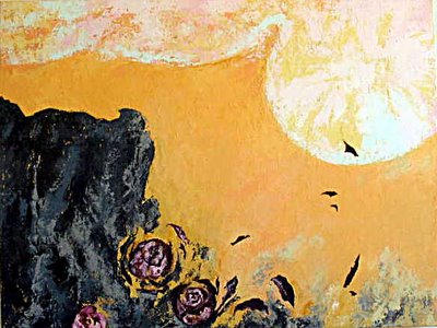
This is how "Dissolution," as it is tentatively and temporarily titled, appeared for about a month after I stalled on it:
General theme--roses, cliff, sun, decay, movement. Love going into light and ashes. Cliche'd rot like that. Don't blame me, I don't make this up, it's dropped into my soul like a bird between two mountains and I have to try to paint it.
So after staring at it for a month I turned it upside down for a fresh, less literal perspective and whacked into it again:
Generally, ambiguity has increased, transitions are richer, and the corny rose shapes are almost obliterated.
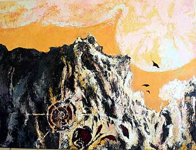
Right side up again; horizon line more dynamic, interesting, fully realized; scratching into the inner 'rose' in a more geometric, compass-like way. Circular shape mirroring sun shape; 'as above, so below' theme seems to be happening.
Extending and defining lines, light, shadow, form; 'roses' starting to appear again out of the muck.
And here we stall again. Trying to integrate 'organic' rose form with geometric compass lines, plus light and texture and variety of color, and signally failing. Tune in next week after next scrapedown.
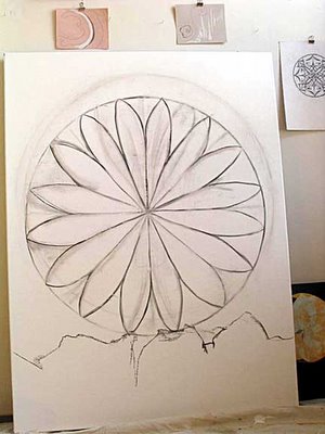
Meanwhile, on the next canvas, we have a grounded mandala:
You would not believe how hard and time-consuming it is to get these things centered and symmetrical.
Still not terribly dynamic.
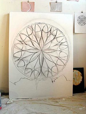
A bit better. This is only a rough estimation; most of the lines will be tweaked and/or obliterated when the actual paint goes on. I have big plans for this one, but that would be telling.
Layer of pale yellow underpainting, which must dry thoroughly before I touch it again, or it will just come off when I paint over it and not remain to glow through when I paint over it with white or scratch into it. It's also incredibly hard not to completely obliterate the charcoal.
Good thing I took photos.
Subscribe to:
Posts (Atom)